Your Logo Doesn't Need to Be Original. It Needs to Mean Something.
Mountains are suddenly appearing in logos everywhere. Before we accuse the entire design industry of running out of ideas, there is a more interesting question: does a logo actually need a completely original symbol, or does it need an original reason for using it?
Oct 5, 2026
8 min
Designers are obsessed with originality.
We want the idea nobody has seen before, the symbol nobody has drawn before and the clever visual trick that makes another designer quietly angry they did not think of it first.
Then someone draws a triangle representing a mountain.
Again.
And somehow it works.
Creative Bloq noticed this happening repeatedly in 2026. Mountains are appearing in identities for the Alpes 2030 Winter Olympics, Vermont, the Utah Mammoth hockey team and other brands, while established identities from The North Face, Toblerone and Paramount Pictures have been using mountains successfully for decades.
So apparently the design industry has collectively rediscovered the triangle. But I think something more interesting is happening.
Originality Is Overrated
That sounds dangerous coming from a designer, so let me explain. Original thinking matters enormously. Original shapes matter much less. There are only so many basic visual symbols available to us. Circles. Arrows. Stars. Eyes. Hands. Suns. Mountains. Animals. Letters.
Designers have been rearranging them for centuries.
If the requirement for a successful logo were a symbol nobody had ever used before, we would have run out of logos somewhere around 1974.
The real question is not whether somebody used the symbol. It is whether the symbol belongs to you.
A Mountain Can Mean Almost Anything
Mountains are particularly useful because they arrive carrying a ridiculous amount of symbolism.
Strength. Ambition. Adventure. Permanence. Nature. Challenge. Achievement.
You can practically hear the brand-strategy presentation already.
“The summit represents our relentless journey toward excellence.”
Thank you, David. Very moving. 😂
That generic symbolism is exactly where things become dangerous.
If you choose a mountain simply because mountains communicate ambition, congratulations: you and approximately 400,000 other businesses now have the same strategy.
Specificity is what saves the idea.
The Best Mountain Logos Point Somewhere Real
Creative Bloq's October 3 analysis makes this distinction nicely. Many of the strongest mountain identities are connected to actual geography rather than generic symbolism. The Utah Mammoth identity references the Wasatch Range, Vermont's tourism wordmark incorporates Camel's Hump, and classic mountain brands often connect their imagery directly to a recognizable landscape or origin story.
Now the mountain is doing more than saying “we are strong.”
It is saying where we come from.
That changes everything.
The symbol stops being decoration and becomes evidence.
Toblerone Proved This by Losing Its Mountain
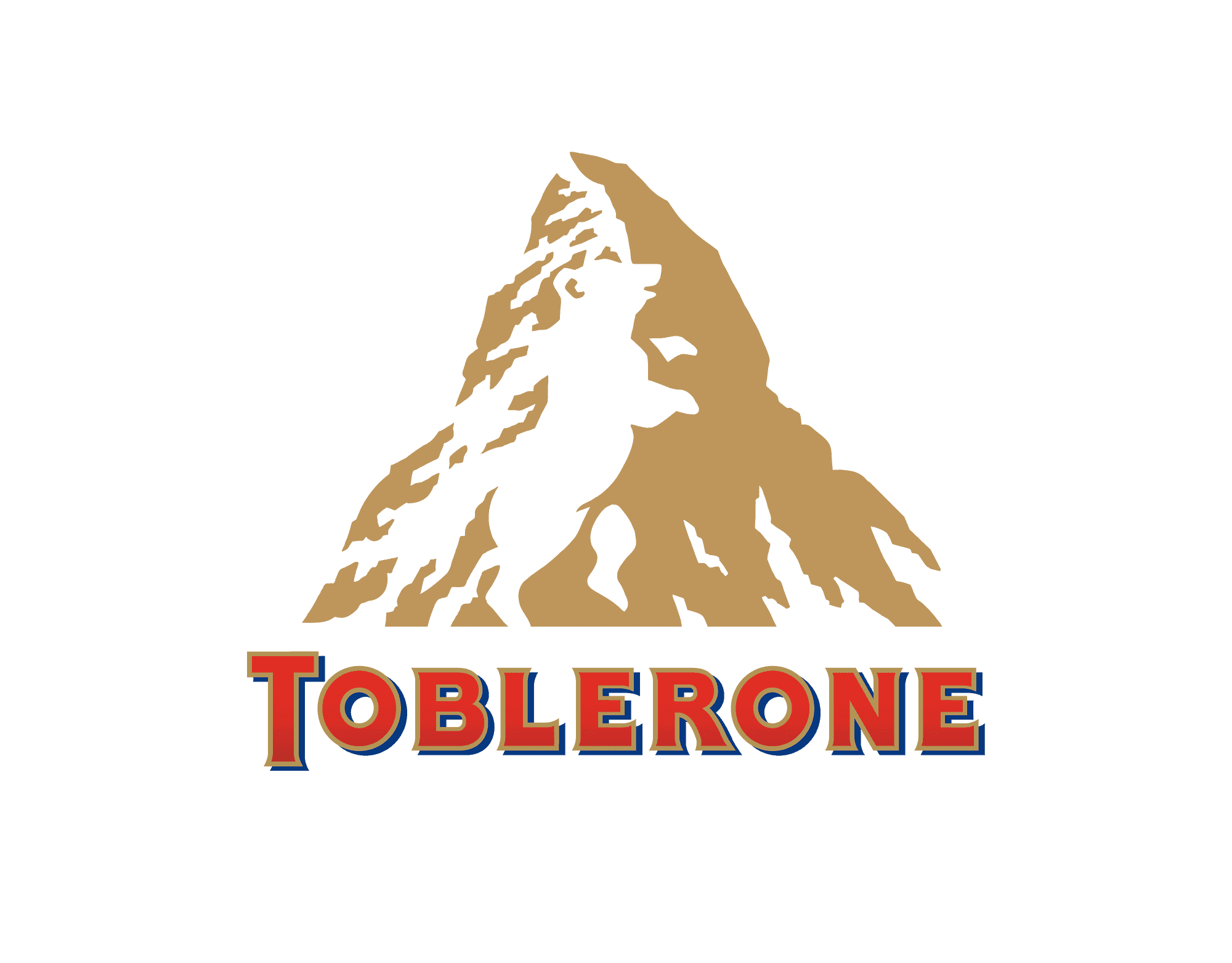
The Toblerone example is especially interesting.
The Matterhorn had been so closely associated with Toblerone that it became part of the brand's Swiss identity. When production changes meant the company could no longer use the mountain under Swissness legislation, the recognizable Matterhorn had to be replaced by a more generic peak. Creative Bloq
The new logo still contains a mountain. Technically, very little changed. Emotionally, quite a lot did. One mountain was a place. The other was a shape.
That is the difference between symbolism and meaning.
Designers Sometimes Try Too Hard to Be Clever
Eventually you produce something incredibly clever. Then you need six slides to explain it. That should occasionally be a warning.
A logo does not receive bonus points because nobody can understand it without the designer standing beside it. Simple symbols survive because people understand them quickly.
The challenge is giving that simple symbol enough specificity that it becomes yours. That can happen through form, typography, context, behavior, motion or the wider identity system.
The logo does not need to perform the entire circus alone.
Familiarity Can Be Useful
Designers sometimes treat familiarity as failure. But familiarity can be incredibly powerful. A heart immediately communicates love. A shield suggests protection. A mountain suggests place, scale or ambition.
The audience already understands part of the message. That gives the designer somewhere to start. The creative work happens in what you do next.
This is similar to what Behance's 2026 trend research says about design more broadly: personality increasingly comes from deliberate details, humanized forms and meaningful systems rather than novelty for novelty's sake.
A Logo Is Not a Creativity Competition
This is something clients also misunderstand occasionally. The purpose of a logo is not to demonstrate how creative the designer is. It needs to identify something. It needs to be recognizable. It needs to work across contexts.
Ideally, it should carry some meaning. If it achieves those things using a familiar symbol, I am perfectly comfortable with that.
I would rather have a simple mountain connected to a real story than an incredibly original abstract mark accompanied by a paragraph explaining that its seventeen angles represent the founder's values.
My Take
I think originality in branding should come from the combination of things rather than one isolated symbol.
The logo. Typography. Color.nPhotography. Motion. Language. Behavior. Story.
Together they create something distinctive.
Mountain logos are not suddenly interesting because mountains are original. They are interesting because the best ones remind us that familiar symbols still have enormous power when they are connected to something true.